

Blog
Automated for the basics, manual for the rest.
How to test a website for accessibility in two tracks, and why coverage matters more than thoroughness.

You test a website for accessibility along two tracks: an automated scan for the basics and manual testing for the rest.
That is not a question of thoroughness, but of coverage.
WCAG 2.2 has 55 success criteria at level A and AA, and an estimated 20 to 40 percent of those can be checked automatically, depending on how you measure it: only a small part is fully assessable by machine.
Since 28 June 2025, the European Accessibility Act, Directive 2019/882, applies.
The directive itself does not name a WCAG version, but sets functional requirements.
In practice, compliance is assessed against EN 301 549, the European standard for ICT accessibility, which in turn refers back to WCAG.
The version currently cited in the Official Journal, v3.2.1, refers to WCAG 2.1 level AA.
Version 4.1.1, published by ETSI on 2 September 2026, refers to WCAG 2.2 level AA and is expected to be cited by the end of 2026.
Under the EAA, no harmonised standard has been cited so far, so there is currently no formal presumption of conformity either.
I test against WCAG 2.2 level AA by default, because that is the most recent version and 2.1 is fully contained in it.
Which version formally applies to your situation is something to have checked legally.
Below is the testing round I run myself: which tools, in what order and how to organise the findings.
What automated tools do and don't find
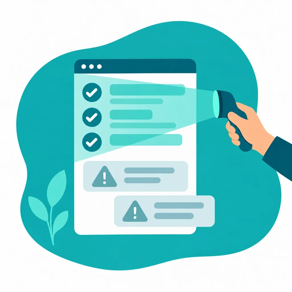
A scanner finds error classes, not user experience.
Tools reliably check what is measurable in the HTML: contrast ratios between specified colours, missing alt attributes, buttons without an accessible name, form fields without a label, a missing lang attribute, ARIA roles with invalid attributes.
You still need to fix those, because they are the errors that occur most often.

What a tool does not judge is the content of what it finds.
Whether the alt text actually matches the image, whether the headings describe the structure instead of just being large, whether the focus order matches what you see, whether a custom-built dropdown behaves the way a user expects, whether an error message explains what went wrong.
A green score in Lighthouse therefore says little on its own.
Roughly speaking, the four WCAG principles, perceivable, operable, understandable and robust, do not automate equally well: a tool still catches part of perceivable and robust, while operable and understandable almost always require manual work.
Tools for the basics, manual work for the rest.
Which free tools are worth using
You don't need a licence to get a first impression.
These seven cover what can be automated, plus the manual work.
| Tool | What it does | When |
|---|---|---|
| axe DevTools | Scans the page against the axe-core rules and points to the element. | First scan per page type. |
| Lighthouse | Runs part of the same axe-core rules inside Chrome DevTools, alongside performance. Fewer rules than axe DevTools itself, so a green score covers less than you'd think. |
Quick check without installing anything. |
| WAVE | Overlays headings, landmarks and errors visually on the page. | Heading structure and reading order. |
| Accessibility Insights | Scan plus guided manual tests per criterion. | When you want a full report. |
| Colour Contrast Analyser | Measures the contrast of colours you point to yourself, including in images. | Text on photos and gradients. |
| Nu HTML Checker | Validates the HTML, including duplicate id values and incorrect nesting. | When a screen reader behaves oddly. |
| NVDA or VoiceOver | Reads the page out loud the way a screen reader user experiences it. | The main flows, final round. |
Run axe-core or pa11y in your build, so fixed errors don't come back.
One thing that doesn't work: an overlay widget that promises accessibility with a single line of JavaScript.
It tweaks the DOM at runtime, but doesn't touch your source code or your components, and sometimes breaks behaviour instead.
Manual testing with the keyboard
Put the mouse aside and go through the site with Tab, Shift+Tab, Enter, space, the arrow keys and Escape.
This is the cheapest manual test and gives you the most per hour.
- Visible focus (2.4.7): you can always see where you are, including inside dropdown menus.
- Focus not obscured (2.4.11, new in 2.2): a sticky header or cookie banner must not fully hide the focused element.
Fully visible focus is stricter (2.4.12, level AAA) and not required. - Focus order (2.4.3): the order follows the visual layout, without jumping to the footer.
- No keyboard trap (2.1.2): you can get out of every modal, carousel and date picker again.
- Bypass blocks (2.4.1): a skip link as the first focus point, that actually works.
- Everything operable (2.1.1): accordions, filters, the menu button and search field, without a mouse.
- Dragging (2.5.7, new in 2.2): anything you drag must also work with single clicks.
- Target size (2.5.8, new in 2.2): at least 24 by 24 CSS pixels, or enough spacing.

Test per page type and per flow, not per page.
A form, a filtered overview and the checkout process cover more ground than a hundred article pages from the same template.
Manual testing with a screen reader
Use NVDA on Windows with Firefox or Chrome, or VoiceOver on macOS with Safari.
NVDA is free, VoiceOver is built into the system, so the entry cost is zero.
Six steps:
- Pull up the headings list, in NVDA with Insert and F7.
Is there one h1 and do the headings describe the page. - Jump from landmark to landmark: header, navigation, main and footer.
- Go through a form in forms mode.
Is each field announced with its label, requirement and help text. - Submit that form with a deliberate mistake.
Is the error announced and are you taken to the right field. - Trigger a dynamic change, such as a filter.
Do you hear that something changed. - Listen to a meaningful and a decorative image.
The first should say something, the second nothing.
To be honest about it: I use a screen reader as a testing tool, not as a daily aid, and that is true for almost every developer.
A round like that does catch the hard errors, but it doesn't tell you whether the site works well for someone who relies on it every day.
For that judgement, you test with real users.
How to organise your findings by success criterion
One finding is one success criterion, in one place, with one way to reproduce it.
A report that just passes on a scanner's raw export is unusable, because the same error from the same template then shows up two hundred times.
| Success criterion | Level | Where | Finding and cause | Impact |
|---|---|---|---|---|
| 1.1.1 Non-text content | A | News teasers | Informative images get an empty alt attribute from the template's field markup. | High |
| 2.4.7 Focus visible | AA | Main navigation | A CSS reset in the theme removes the outline without an alternative. | High |
| 1.4.3 Contrast | AA | Secondary buttons | The ratio stays below 4.5:1 because of one colour token in the design tokens. | Medium |
Then give each criterion one of three statuses: passes, fails, or not applicable.
That last one is not an escape route, because you still have to explain why a criterion doesn't apply.
Sort by cause rather than by page, because a single fix in a component often clears up dozens of findings.
That way you keep the evidence you need if an accessibility statement is mandatory for you.
What a test round doesn't cover
A test checks your site, not your obligation.
Four things fall outside it structurally.
- The legal question: whether the EAA applies to you depends on what you offer, so have that checked legally.
Read first whether the European Accessibility Act applies to your website. - Third parties: embedded video, maps, payment modules and cookie banners sit on your page, not in your codebase.
- Documents: PDF and Office files fall under EN 301 549 and need their own assessment.
- Editorial content: the result shifts with every publication, so a test stays a snapshot for as long as you haven't locked the principles into your components.
Do you have a scan report nobody can act on, or do you want to know where your site stands per success criterion? Take a look at what a digital accessibility project involves, or lay out your situation via contact.
I'll review your request and give you an honest picture within 24 hours of what's needed.
Frequently asked questions
Which tools do you use to test a website for accessibility?
I start with axe DevTools on every page type, use WAVE to lay heading structure and landmarks visually over the page, and Colour Contrast Analyser for text on photos and gradients.
Accessibility Insights if you want a full report, the Nu HTML Checker for odd behaviour in a screen reader, and NVDA or VoiceOver for the main flows.
Lighthouse runs a subset of the same axe-core rules and is handy for a spot check without installation.
All of those tools are free.
On top of that, run axe-core or pa11y in your build, so fixed errors don't come back.
What doesn't an automated accessibility scan find?
The substance of what it finds.
A tool sees that an alt attribute is missing, not whether the alt text actually matches the image.
It sees the headings, not whether they describe the structure rather than just being large.
It doesn't see whether the focus order matches what you see visually, whether a custom-built dropdown behaves the way a user expects, or whether an error message explains what actually went wrong.
Of the 55 success criteria at level A and AA, an estimated 20 to 40 percent can be tested automatically, depending on how you measure, and only a small part can be judged fully automatically.
How do you test your website with the keyboard?
Put the mouse away and go through the site with Tab, Shift+Tab, Enter, space, the arrow keys and Escape.
You watch for visible focus (2.4.7), focus that doesn't get covered by a sticky header or cookie banner (2.4.11), a focus order that follows the visual layout (2.4.3), no keyboard trap in modals, carousels and date pickers (2.1.2), a skip link as the first focus point that actually works (2.4.1), and accordions, filters, the menu button and the search field that are operable without a mouse (2.1.1).
Do that per page type and per flow, not per page.
This is the cheapest manual test and delivers the most per hour.
Do you need a screen reader to test, and which one?
For the main flows, yes.
Use NVDA on Windows with Firefox or Chrome, or VoiceOver on macOS with Safari: NVDA is free and VoiceOver is built into the system, so the entry cost is zero.
Pull up the heading list, in NVDA with Insert and F7, jump from landmark to landmark, go through a form in form mode, submit it deliberately wrong, trigger a dynamic change such as a filter, and listen to an informative image next to a decorative one.
A round like that will find the hard errors, but doesn't say whether the site works well for someone who relies on it every day.
For that judgement, test with real users.
How often do you need to retest for accessibility?
That depends on your release rhythm, not on the calendar.
Run axe-core or pa11y in every build, so whatever can be found automatically gets tested continuously.
Manually retest whatever you touch: if a template, a component or a flow changes, you rerun the keyboard round and the screen reader round for that page type.
And because the result shifts with every publication, a test remains a snapshot for as long as you haven't locked the principles into your components.
A question about this topic?
Briefly describe your situation, and I'll let you know what's going on and what it would cost. No sales pitch.


